4.1.2 Graphs & Diagrams
Graphs & Diagrams
Graphs & Diagrams
Key terminology
Term | Definition |
|---|---|
Continuous data | Numerical data that can take any value within a given range, e.g. heights and weights |
Discrete data | Numerical data that can only take certain values, e.g. shoe size |
Quantitative data | Results that can be expressed using numerical values |
Qualitative data | Results that can’t be expressed as numbers, e.g. opinions |
Line graph
One of the simplest ways to display continuous data
Both axes are numerical and continuous
Used to show changes over time and space
Strengths | Limitations |
|---|---|
Shows trends and patterns clearly | Does not show causes or effects |
Quicker and easier to construct than a bar graph | Can be misleading if the scales on the axis are altered |
Easy to interpret | If there are multiple lines on a graph it can be confusing |
Anomalies are easy to identify | Often requires additional information to be useful |
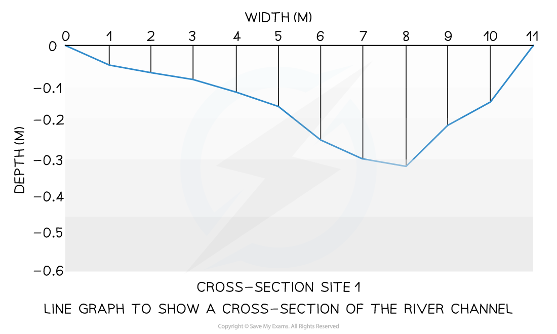
A river cross-section is a particular form of line graph because it is not continuous data, but the plots can be joined to show the shape of the river channel
Bar chart
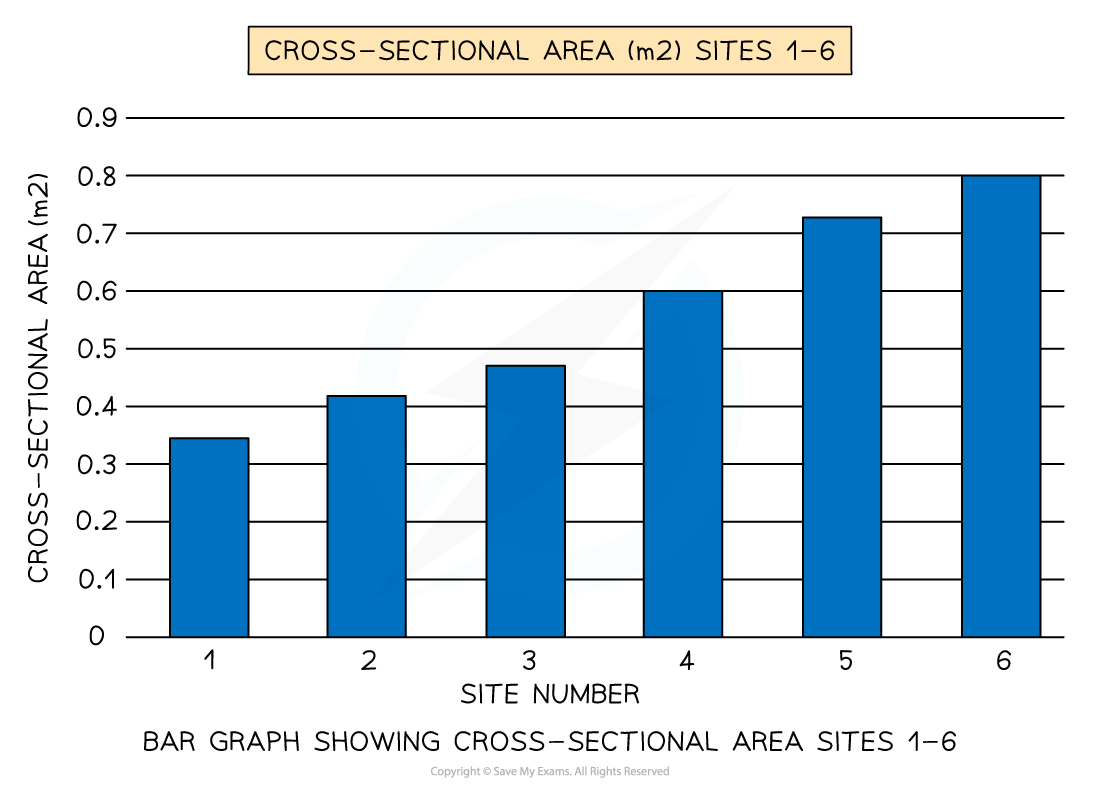
A bar chart is the simplest form of displaying data
Each bar is the same width, but can have varying lengths
Each bar is drawn an equal distant apart (equidistant)
The data is discrete data
Bar graphs are useful for:
Comparing classes or groups of data
Changes over time
Strengths | Limitations |
|---|---|
Summarises a large set of data | Requires additional information |
Easy to interpret and construct | Does not show causes, effects or patterns, can be too simplistic |
Shows trends clearly | Can only be used with discrete data |
Histograms
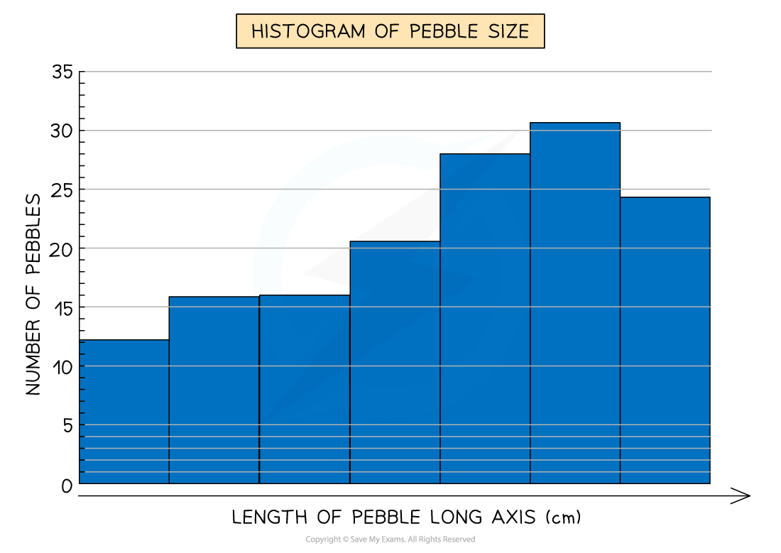
Histograms show continuous data
Always use a ruler to draw the bars
All bars should be the same width
The top of the bar should reach the number on the side of the graph that is being represented
There should be no gaps, all bars should be touching
Ensure all axes are labelled and that the graph has a title
Strengths | Limitations |
|---|---|
Large data sets can be graphed easily | They can only be used for numerical data |
You can compare data | Can be difficult to pinpoint exact data values |
Compound or divided bar chart
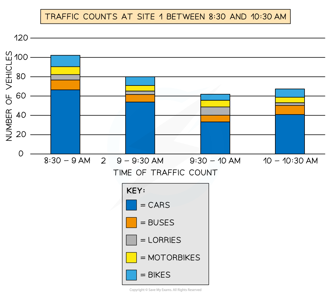
The bars are subdivided to show the information with all bars totalling 100%
Divided bar charts show a variety of categories
They can show percentages and frequencies
Strengths | Limitations |
|---|---|
A large amount of data can be shown on one graph | A divided bar chart can be difficult to read if there are multiple segments |
Percentages and frequencies can be displayed on divided bar char | Can be difficult to compare sometimes |
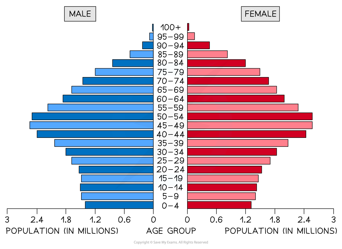
Population pyramid
A type of histogram
Used to show the age-sex of a population
Can be used to show the structure of an area/country
Patterns are easy to identify
Strengths | Limitations |
|---|---|
Easy to compare age and sex data | Can take a long time to construct |
Easy to read and annotate | Detail can be lost in the data (figures just show a cohort); additional annotations may be necessary |
Pie chart
Used to show proportions, the area of the circle segment represents the proportion
A pie chart can also be drawn as a proportional circle
Pie charts can be located on maps to show variations at different sample sites
Percentage of pie chart must add to 100%
To calculate degrees of the pie chart (which totals 360°) divide the percentage by 100 and then multiply by 360
Each segment should be a different colour
Strengths | Limitations |
|---|---|
Clearly shows the proportion of the whole | Does not show changes over time, hard to compare two sets of data |
Easy to compare different components | Difficult to understand without clear labelling |
Easy to label | Calculating the size of each section can be difficult |
Information can be highlighted by separating segments | Can only use for a small number of categories otherwise lots of segments become confusing |

Pie Chart Showing Energy Sources in an Area
Rose diagram
Use multidirectional axes to plot data with bars
Compass points are used for the axis's direction
Can be used for data such as wind direction, noise or light levels
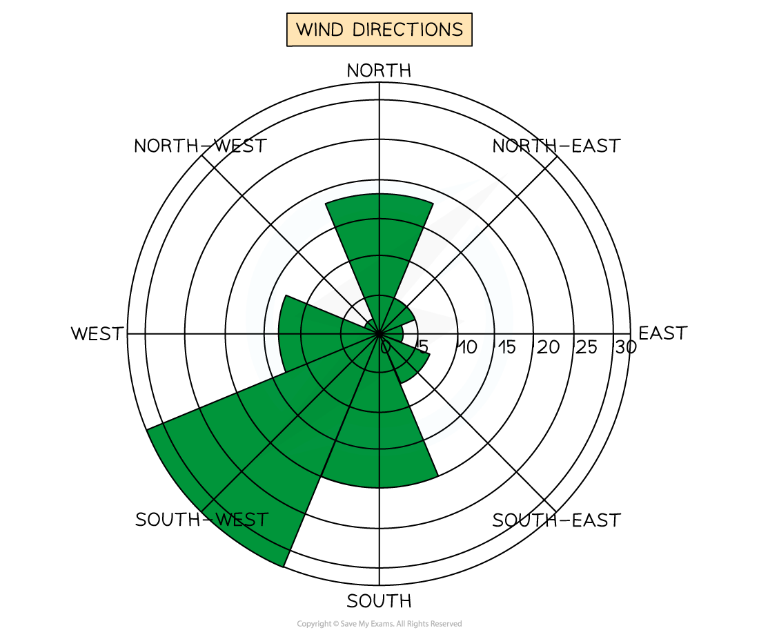
Wind Direction Shown on a Rose Diagram
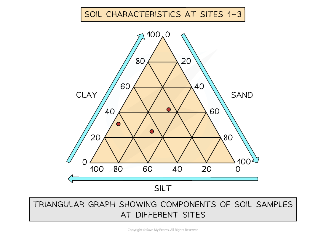
Triangular graph
Have axes on three sides all of which go from 0-100
Used to display data which can be divided into three
The data must be in percentages
Can be used to plot data such as soil content, employment in economic activities
Read each side carefully so you are aware which direction the data should go in
Scatter graph
Points should not be connected
The best fit line can be added to show the relations
Used to show the relationship between two variables
In a river study, they are used to show the relationship between different river characteristics such as the relationship between the width and depth of the river channel
Strengths | Limitations |
|---|---|
Clearly shows data correlation | Data points cannot be labelled |
Shows the spread of data | Too many data points can make it difficult to read |
Makes it easy to identify anomalies and outliers | Can only show the relationship between two sets of data |
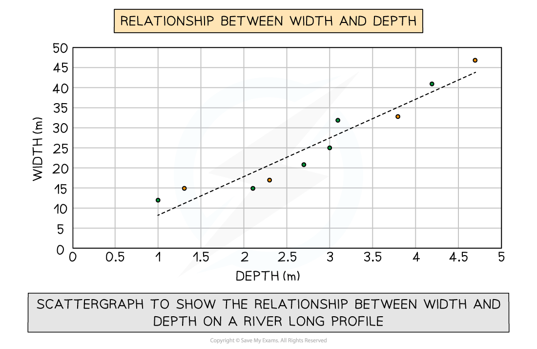
Scatter graph to show the Relationship Between Width and Depth on a River Long Profile
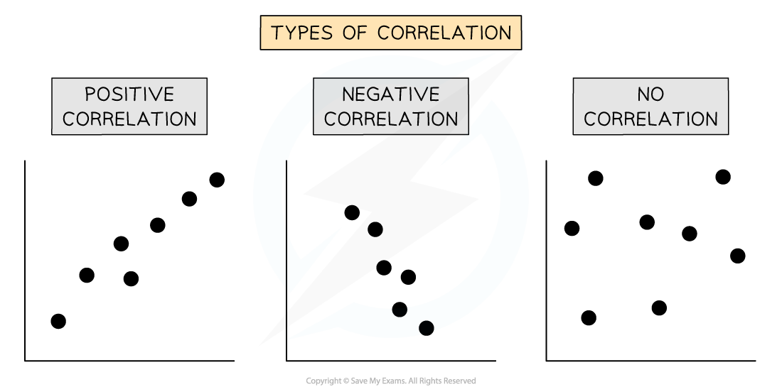
Types of correlation
Positive correlation
As one variable increases, so too does the other
The line of best fit goes from bottom left to top right of the graph
Negative correlation
As one variable increases the other decreases
The line of best fit goes from the top left to the bottom right of the graph
No correlation
Data points will have a scattered distribution
There is no relationship between the variables
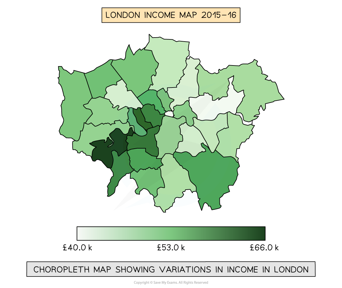
Choropleth map
Maps which are shaded according to a pre-arranged key
Each shade represents a range of values
It is common for one colour in different shades to be used
Can be used for a range of data such as annual precipitation, population density, income levels, etc...
Strengths | Limitations |
|---|---|
The clear visual impression of the changes over space | Makes it seem as if there is an abrupt change in the boundary |
Shows a large amount of data | Distinguishing between shades can be difficult |
Groupings are flexible | Variations within the value set are not visible |
Proportional symbols map
The symbols on the map are drawn in proportion to the variable represented
Usually, a circle or square is used but it could be an image
Can be used to show a range of data, for example, population, wind farms and electricity they generate, traffic or pedestrian flows
Strengths | Limitations |
|---|---|
Illustrates the differences between many places | Not easy to calculate the actual value |
Easy to read | Time-consuming to construct |
Data is specific to particular locations | Positioning on a map may be difficult, particularly with larger symbols |
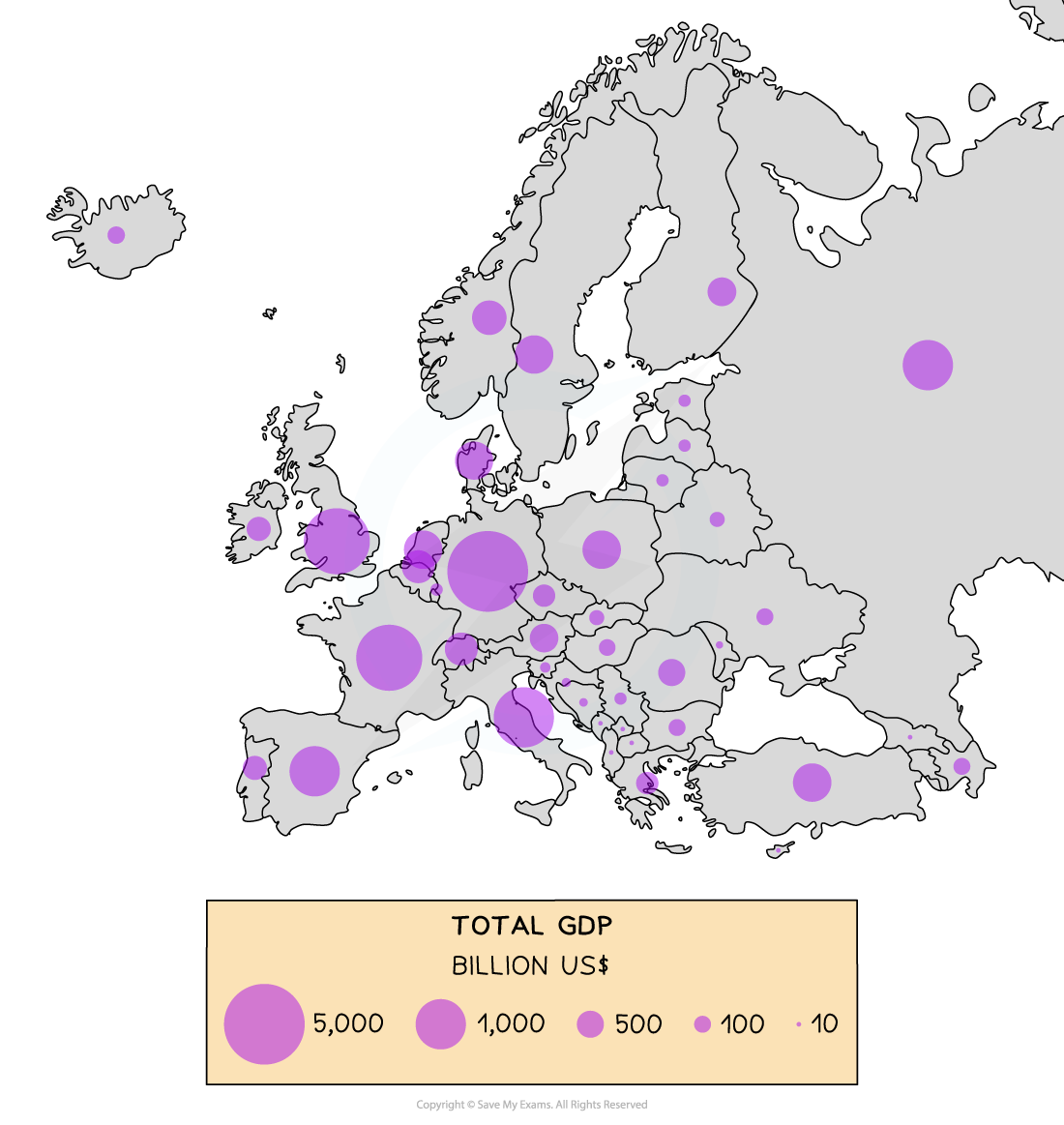
Proportional Circles Map Showing GDP (Billion US$) across Europe
Pictograms
These are a way of displaying data using symbols or diagrams drawn to scale
Useful way of showing data if accuracy is not too important and data is discrete
Years do not need to be continuous
Symbols do not need to be whole but can represent a proportion
A key is needed to show if the total number of objects or events that image represents exceeds one
How to read a pictogram
Step 1: Read the problem carefully and identify the specific information requested from the pictograph
Step 2: Count the symbols corresponding to the desired information and report the count
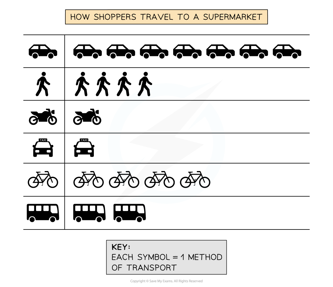
In the pictogram above, you can see that 4 shoppers walked to the supermarket, but only one used a taxi
The majority of shoppers used a car to travel to the supermarket