StudyDeck

Charts

Exam code: 2217
Written by: Ashika|Reviewed by: Caroline Carroll|Updated 2 July 2026

Bar chart

Bar Chart

  • A bar chart is the simplest form of displaying data

  • Each bar is the same width but can have varying lengths

  • Each bar is drawn an equal distance apart (equidistant)

  • The data is discrete data

  • Bar graphs are useful for:

    • Comparing classes or groups of data

    • Changes over time

Strengths

  • Summarises a large set of data 

  • Easy to interpret and construct

  • Shows trends clearly

Limitations

  • Requires additional information

  • Does not show causes, effects or patterns; can be too simplistic

  • Can only be used with discrete data

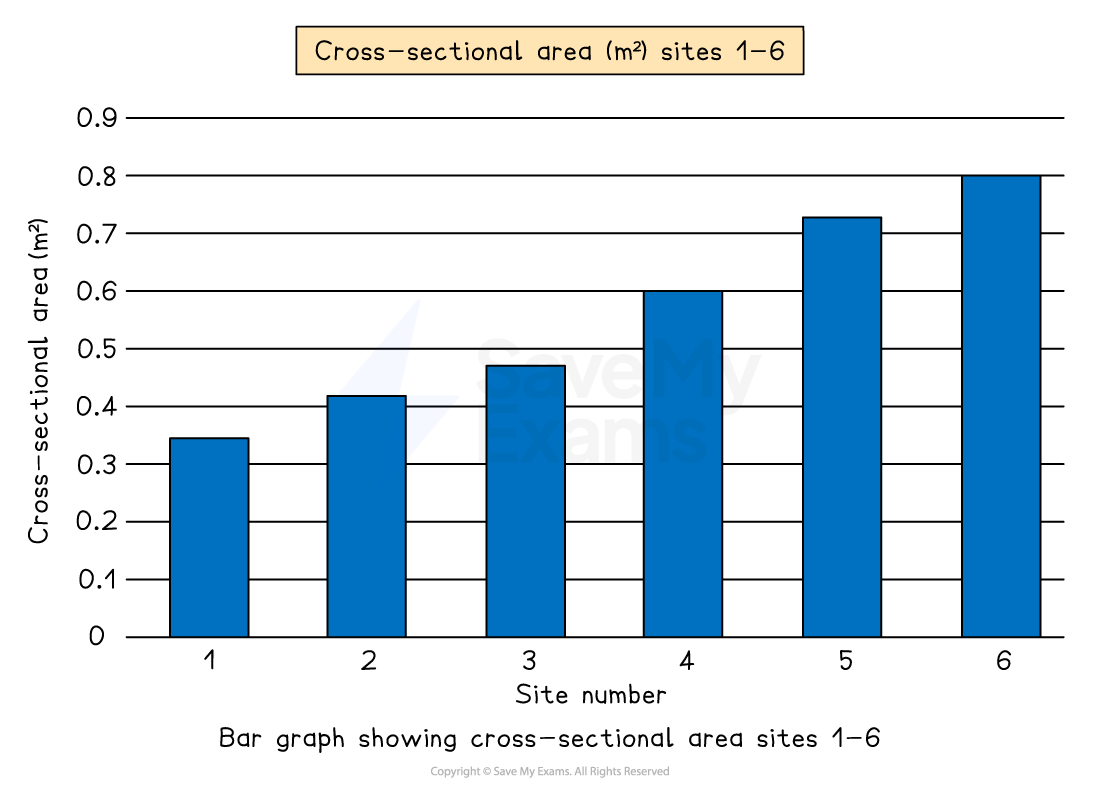
Bar graph of cross-sectional area in square metres for sites 1 to 6, showing an increasing trend from site 1 through site 6.
Example of a bar graph

Compound or divided bar chart

Compound or Divided Bar Chart

  • The bars are subdivided to show the information, with all bars totalling 100%

  • Divided bar charts show a variety of categories

  • They can show percentages and frequencies

Strengths

  • A large amount of data can be shown on one graph. 

  • Percentages and frequencies can be displayed on divided bar charts

Limitations

  • A divided bar chart can be difficult to read if there are multiple segments

  • It can be difficult to compare data sometimes

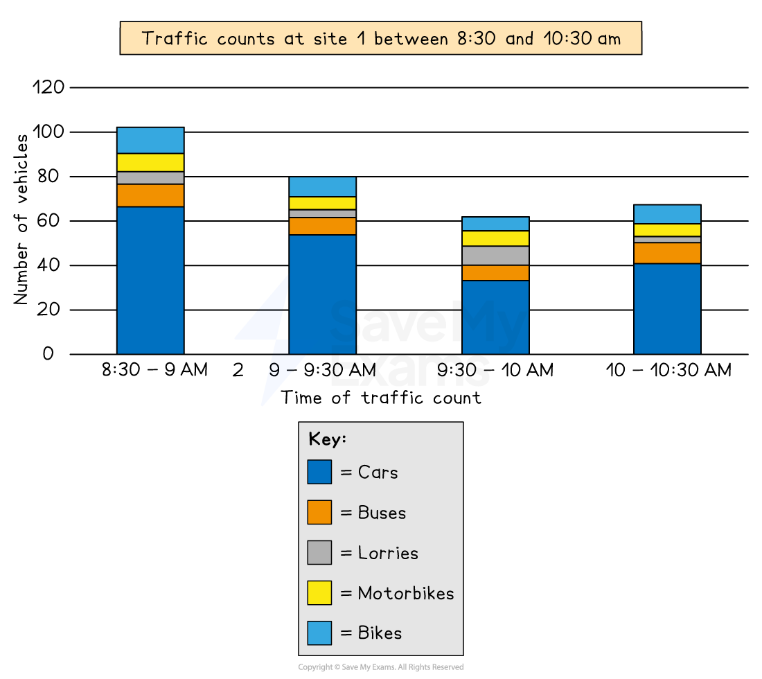
Bar chart showing traffic counts at site 1 from 8:30 to 10:30 am, with categories for cars, buses, lorries, motorbikes, and bikes.
A compound or divided bar chart

Population pyramid

Population Pyramid

  • The characteristics of a population—the distribution of age, sex, ethnicity, religion, etc.—are known as the population structure

  • The two main components of age and sex can be shown on a population pyramid

  • This is a graphical illustration of the distribution of a given population, grouped by age and gender

  • It can be used to represent a population of any region, city, country or even the world

  • As the population grows the shape of the pyramid changes 

  • The population pyramid can be used to identify the following groups:

    • Young dependants 

    • Old dependents 

    • Economically active (working population)

    • Dependency ratio 

Strengths

  • Easy to compare age and sex data

  • Easy to read and annotate

Limitations

  • Can take a long time to construct

  • Detail can be lost in the data (figures just show age groups there can be variation within the groups); additional annotations may be necessary

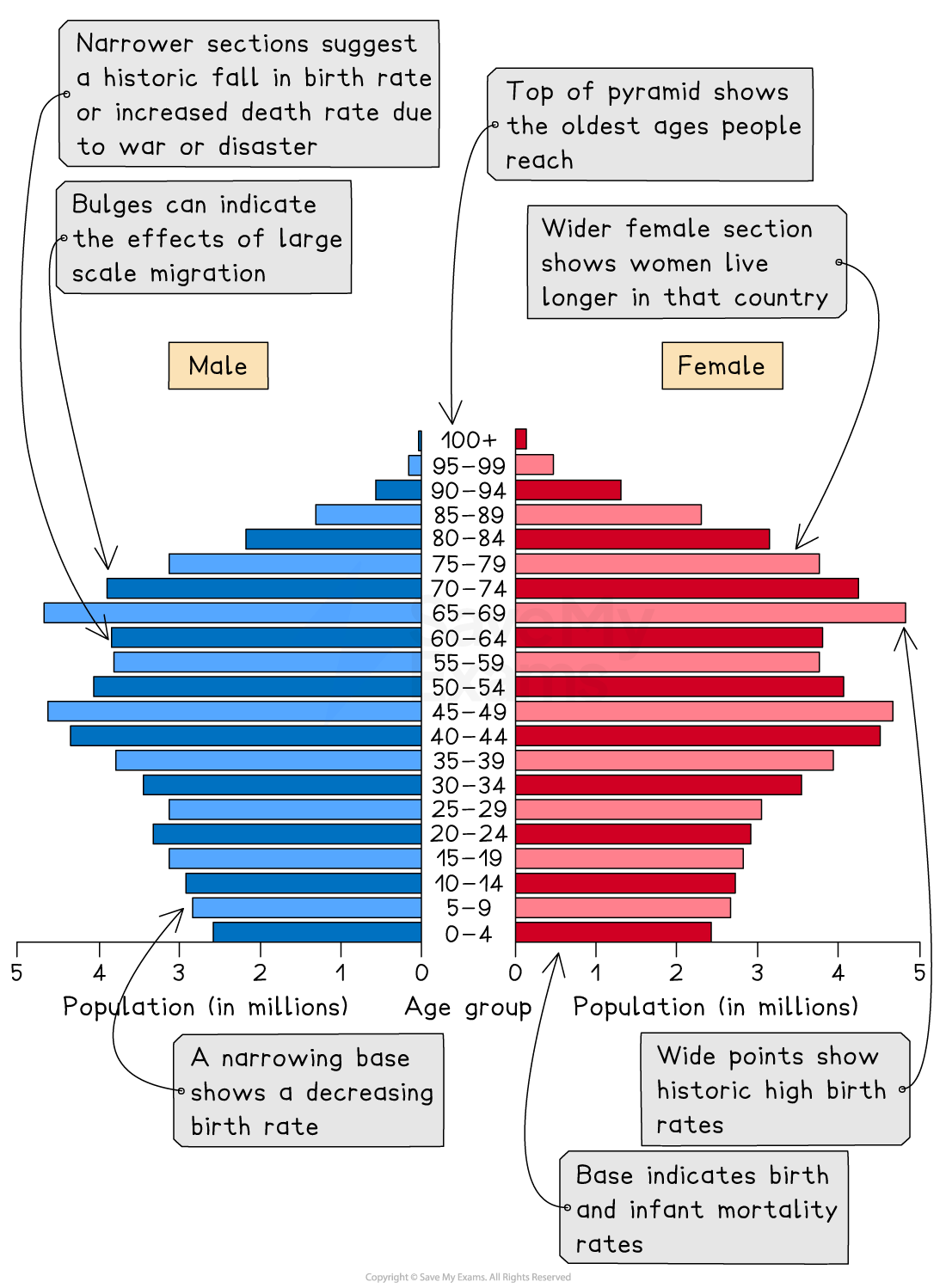
Population pyramid with blue male and red female sections showing age distribution, migration effects, birth and death rates, and gender longevity differences.
Population pyramid

Pie Chart

Pie Chart

  • Used to show proportions, the area of the circle segment represents the proportion

  • A pie chart can also be drawn as a proportional circle 

  • Pie charts can be located on maps to show variations at different sample sites

  • The percentage of the pie chart must add up to 100%

  • To calculate degrees of the pie chart (which totals 360°), divide the percentage by 100 and then multiply by 360

  • Each segment should be a different colour

Strengths

  • Clearly shows the proportion of the whole

  • Easy to compare different components

  • Easy to label

  • Information can be highlighted by separating segments

Limitations

  • Does not show changes over time; hard to compare two sets of data

  • Difficult to understand without clear labelling

  • Calculating the size of each section can be difficult

  • Can only be used for a small number of categories; otherwise, lots of segments become confusing

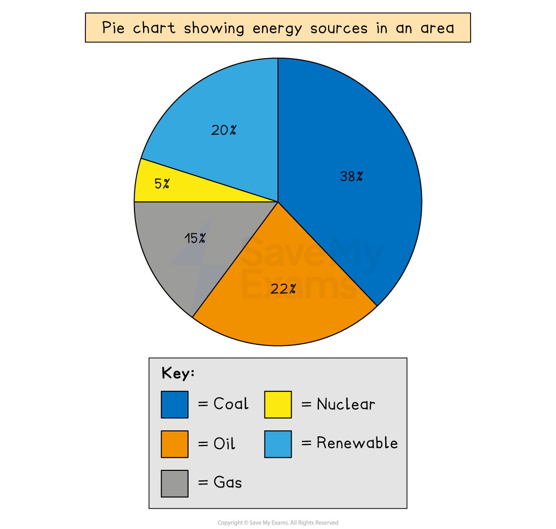
Pie chart of energy sources: 38% coal, 22% oil, 20% renewable, 15% gas, 5% nuclear.
Example of a pie chart

Rose diagram

Rose diagram

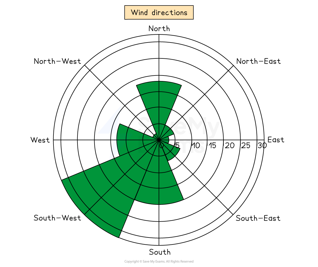
A rose diagram is a type of radial graph

  • It uses compass points for the axis directions

  • Can be used for data such as wind direction, noise or light levels

Strengths

  • Clearly show patterns

  • Multiple sets of data can be compared

Limitations

  • Can be difficult to plot

  • Can only be used for certain types of data

  • Hard to identify anomalies

Wind rose chart showing wind directions with green shaded areas, highlighting predominant winds from North, West, and South-West.
Rose diagram showing wind direction

Histograms

Histograms

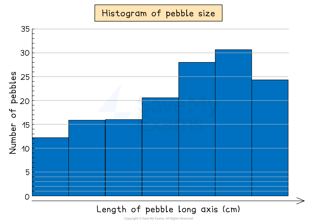
  • Histograms show continuous data

  • Always use a ruler to draw the bars

  • All bars should be the same width 

  • The top of the bar should reach the number on the side of the graph that is being represented

  • There should be no gaps; all bars should be touching

  • Ensure all axes are labelled and that the graph has a title

Strengths

  • Large data sets can be graphed easily

  • Data can be compared

Limitations

  • Can be difficult to pinpoint exact data values

  • They can only be used for numerical data

Histogram showing the number of pebbles by length in centimetres. Bars range from 10 to 30 pebbles, increasing from left to right.
Example of a histogram