Graphs
Key terminology
Key terminology
Types of data
Continuous data is numerical data that can take any value within a given range, e.g. heights and weights
Discrete data is numerical data that can only take certain values, e.g. shoe size
Quantitative data is where the results can be expressed using numerical values
Qualitative data is where the results can’t be expressed as numbers, e.g. opinions
Line graphs
Line graphs
One of the simplest ways to display continuous data
Both axes are numerical and continuous
Used to show changes over time or space
Strengths |
|
|---|---|
Limitations |
|
Example
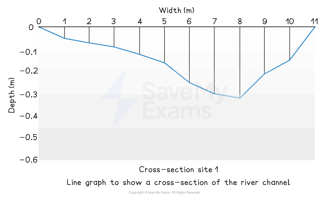
A river cross-section is a particular form of line graph because it is not continuous data, but the plots can be joined to show the shape of the river channel
Radial graphs
Radial graphs
Use multidirectional axes to plot data with bars or lines
Strengths |
|
|---|---|
Limitations |
|
Climate graphs
Climate graphs
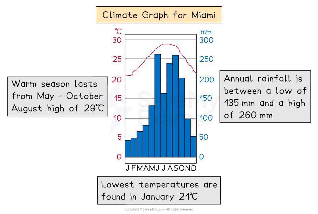
A climate graph shows mean monthly temperatures and precipitation rates over 30 years
They can be local, national, or global
Precipitation is always shown as a bar graph and temperature as a line graph
Strengths |
|
|---|---|
Limitations |
|
Dispersion graphs
Dispersion graphs
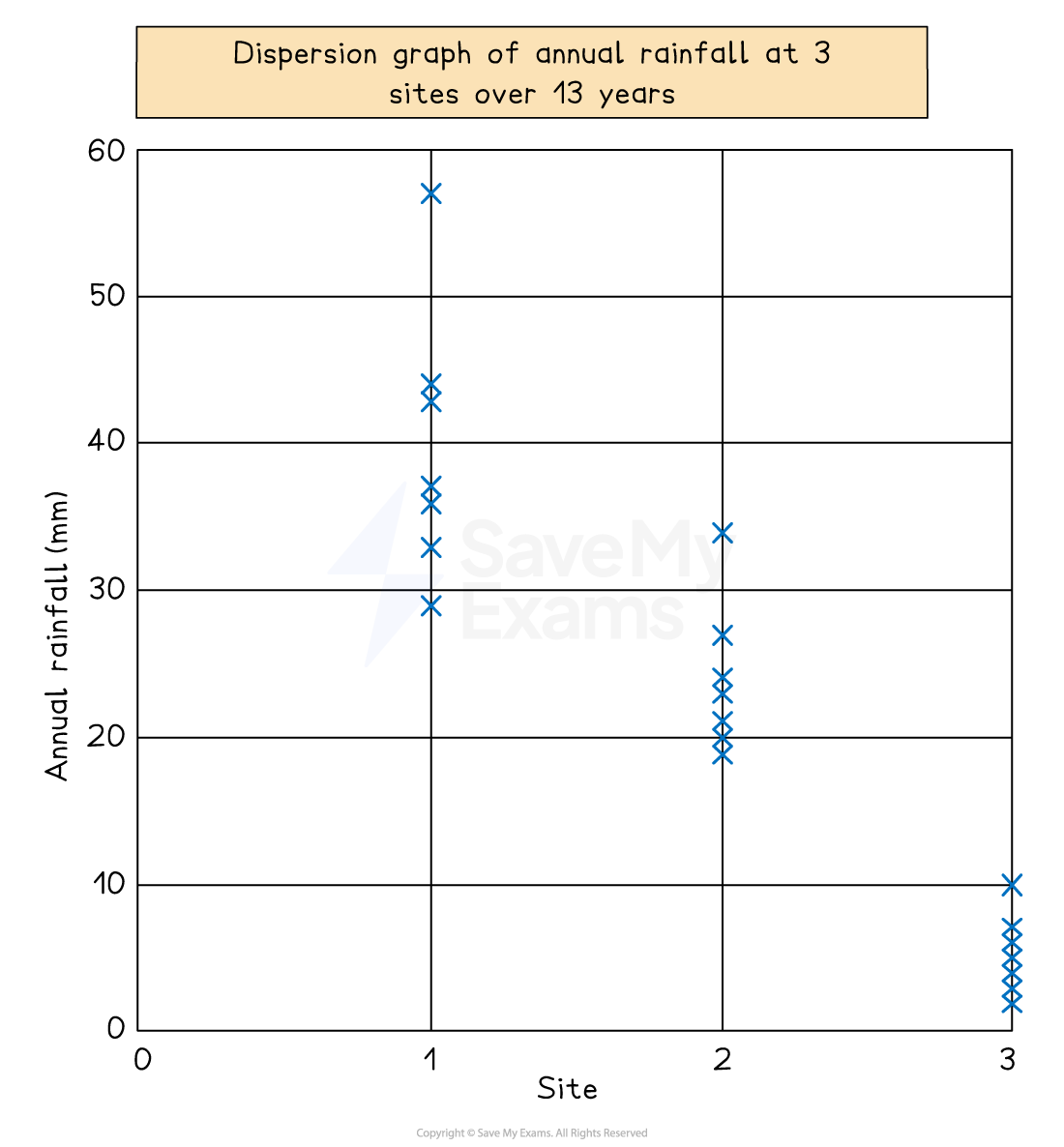
Dispersion graphs are used to compare sets of data
They also illustrate whether the data forms groups or is dispersed (spread)
Values are shown on the vertical axis
Can also be used to present the upper and lower values along with the mean, median, mode and extreme values
Strengths |
|
|---|---|
Limitations |
|
Doughnut graphs
Doughnut graphs
Doughnut graphs visually represent proportions as part of a whole
They are similar to a pie chart but with no centre
Strengths |
|
|---|---|
Limitations |
|
Kite graphs
Kite graphs
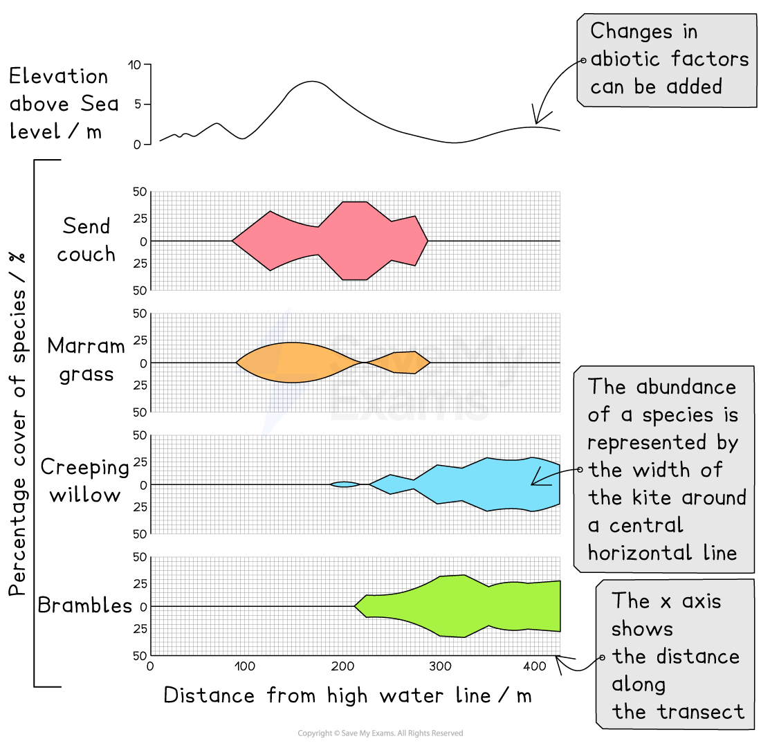
Kite diagrams can show both distribution and amounts
The distribution along a transect is shown by its position along a line in each section of a kite diagram
Each section represents a different species
The distance along the transect is given on the x-axis
The numbers are shown by the width of the 'kite' around the central horizontal line
The shape is referred to as a kite because it extends an equal distance on each side of the central horizontal line
Strengths |
|
|---|---|
Limitations |
|
Triangular graphs
Triangular graphs
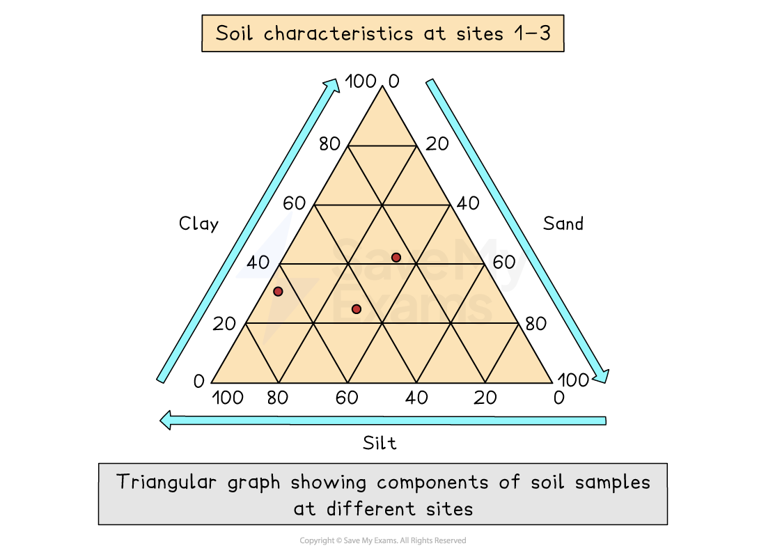
Triangular graphs have axes on three sides, all of which go from 0 to 100
Used to display data which can be divided into three
The data must be in percentages
Can be used to plot data such as soil content, employment in economic activities
Strengths |
|
|---|---|
Limitations |
|
Scatter graphs
Scatter graphs
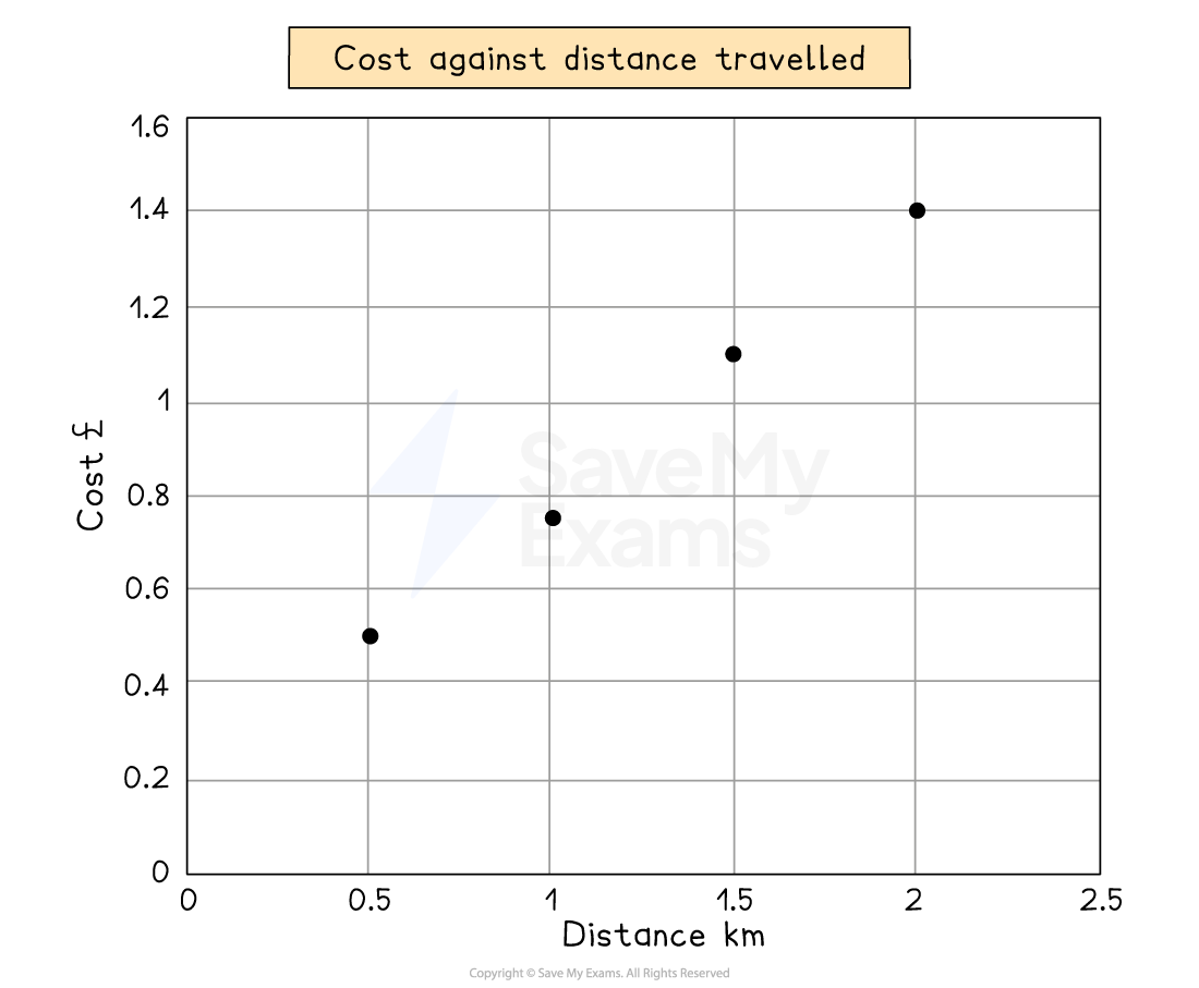
Used to show the relationship between two variables
In a river study, they are used to show the relationship between different river characteristics such as the relationship between the width and depth of the river channel
The points on a scatter graph should not be connected
The best-fit line can be added to show the relationship
Strengths |
|
|---|---|
Limitations |
|
Flood hydrographs
Flood hydrographs
Used to show the impact of a storm event on river discharge
The bar chart shows the precipitation total (mm)
The line graph shows the river discharge (cumecs)
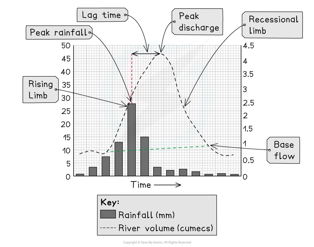
The graph shows a short period, usually 24 hours
The storm hydrograph has several features:
Base flow, which is the 'normal' level of river discharge
The water mainly comes from groundwater flow
Peak rainfall is the highest rainfall level during the storm
The time of the peak rainfall is taken from the centre of the bar
The rising limb shows the increase in the river discharge
The steeper the limb, the faster the river discharge has increased
Peak discharge is the highest level of discharge in the river
Lag time is the time difference between the peak rainfall and the peak discharge
The shorter the lag time, the higher the risk of flooding because the river may not have the capacity to contain the increase in discharge
Where there is more overland flow (surface runoff), the lag time will be shorter
The recessional limb shows the river discharge returning to normal flow
The steeper the recessional limb is, the faster the river returns to normal flow
The shape of the flood hydrograph indicates some of the factors that may affect the discharge
A hydrograph with a steep rising limb and short lag time is likely to be in an area with one or more of the following:
Impermeable surfaces (urban areas)
Heavy precipitation
Snow melt
Steep slopes
Impermeable soil (saturated or frozen)
A hydrograph with a gentle rising limb and long lag time is likely to be in an area with one or more of the following:
Rural area with trees
Permeable surfaces
Gentle slopes