Diagrams
Flow diagrams
Flow Diagrams
Flow diagrams are used to show the movements or flows of people, goods, or materials
Desire lines are used to show the general direction of movement on a base map using lines
More detailed information is shown in flow line diagrams
The lines can be used to show quantity (by the thickness of the line)
Pictograms
Pictograms
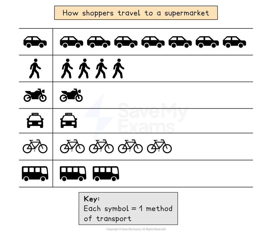
Pictograms are a way of displaying data using symbols or diagrams drawn to scale
Useful way of showing data if accuracy is not too important and data is discrete
Years do not need to be continuous
Symbols do not need to be whole but can represent a proportion
A key is needed to show if the total number of objects or events that image represents exceeds one
How to read a pictogram
Step 1: Read the problem carefully and identify the specific information requested from the pictogram
Step 2: Count the symbols corresponding to the desired information and report the count
Venn Diagrams
Venn Diagrams
Venn diagrams can be used to visualise and compare information
A Venn diagram is an illustration which uses overlapping circles
They can be used to:
Illustrate similarities and differences for example between urban and rural areas
Show relationships between sets of data
Strengths |
|
|---|---|
Limitations |
|
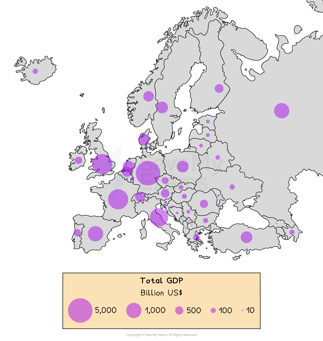
Proportional Symbols
Proportional Symbols
The symbols on the map are drawn in proportion to the variable represented
Usually, a circle or square is used but it could be an image
Can be used to show a range of data, for example, population, wind farms and electricity they generate, traffic or pedestrian flows
Strengths |
|
|---|---|
Limitations |
|