Bar Charts & Pictograms
Bar Charts & Pictograms
Bar charts & pictograms
What is a bar chart?
A bar chart is a visual way to represent discrete data
Discrete data is data that can be counted
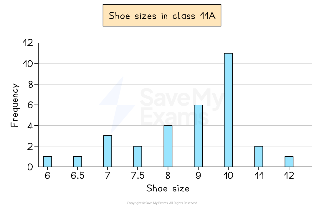
This can be numerical like shoe sizes in a class
Or non-numerical (categorical) like colours of cars down a road
The horizontal axis shows the different outcomes
The vertical axis shows the frequency
The heights of the bars show the frequency
Bars should be separated by gaps
Bars should have equal widths
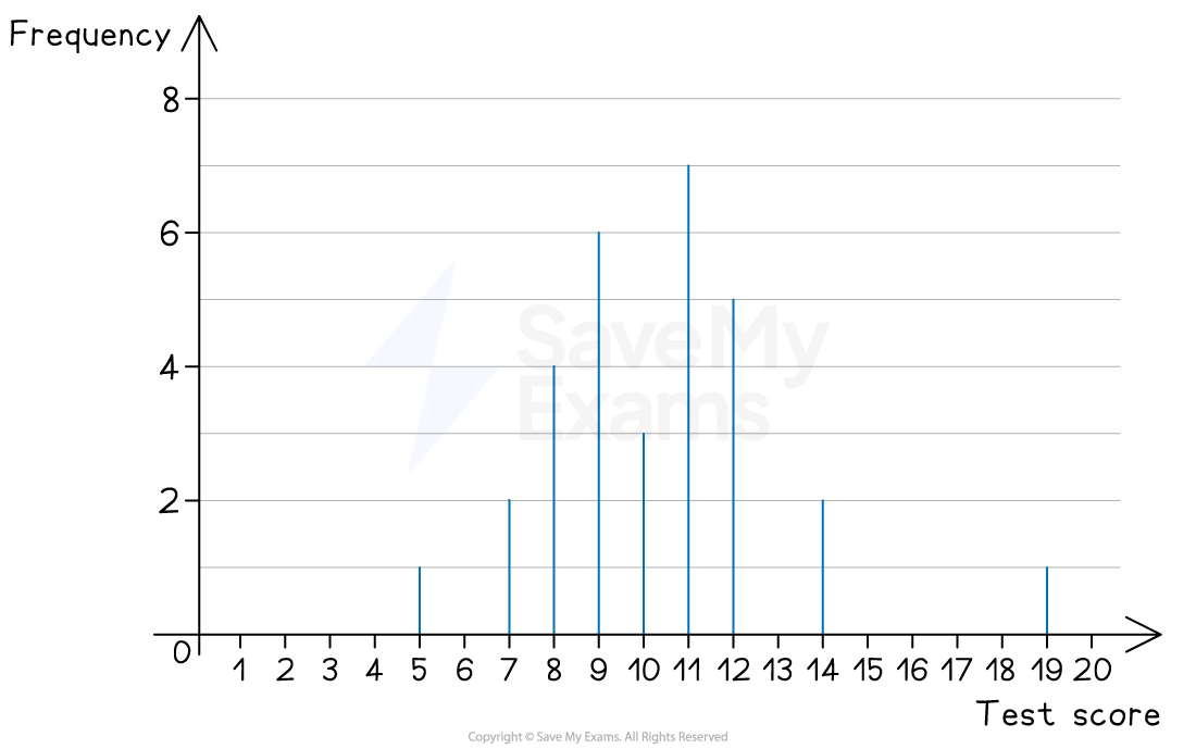
The mode is the outcome with the highest bar
You can also get dual bar charts to compare two data sets
Bars are in pairs (side-by-side) for each outcome
What is a pictogram?
A pictogram is an alternative to a bar chart
It is used in the same situations
There are no axes
Frequency is represented by symbols
A key shows the value of 1 symbol
For example, 1 symbol represents a frequency of 2
Half and quarter symbols are often used
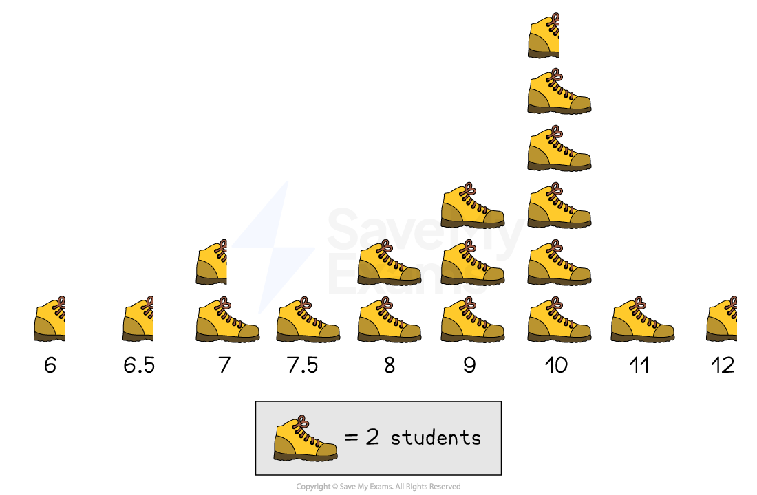
The pictogram above shows the shoe sizes of students in a class
As 1 picture of a shoe represents 2 students
Half a shoe represents 1 student
The number of students with a shoe size of 7, is 3