Pie Charts
Pie Charts
Pie charts
What is a pie chart?
A pie chart is a circle divided into sectors which is used to present data
The sectors represent different categories
They show the relative proportions of the categories
They do not show the actual frequencies of each category
How do I draw a pie chart?
This is easiest explained through an example
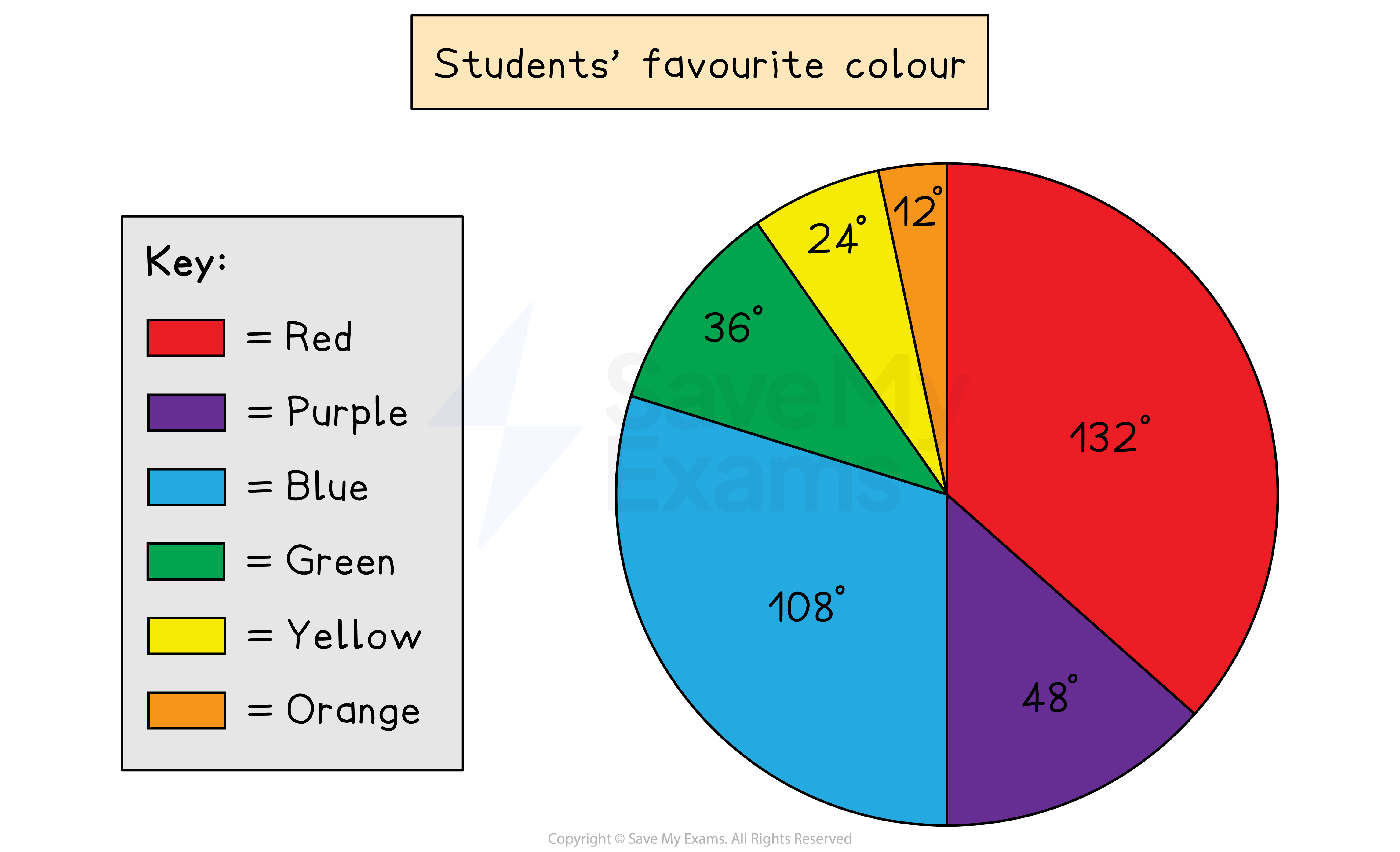
The following data shows the favourite colours of a class of students
Colour | Red | Purple | Blue | Green | Yellow | Orange |
|---|---|---|---|---|---|---|
Students | 11 | 4 | 9 | 3 | 2 | 1 |
Write the frequencies as fractions of the total number of students, 30
Colour | Red | Purple | Blue | Green | Yellow | Orange |
|---|---|---|---|---|---|---|
Students | 11 | 4 | 9 | 3 | 2 | 1 |
Fractions |
Find the angles of the sectors by multiplying each fraction by 360°
Then check all angles add up to 360°
Colour | Red | Purple | Blue | Green | Yellow | Orange |
|---|---|---|---|---|---|---|
Students | 11 | 4 | 9 | 3 | 2 | 1 |
Fractions | ||||||
Angles | 132° | 48° | 108° | 36° | 24° | 12° |
Draw a vertical line from the circle's centre to the top, then use a protractor to mark off the first angle
Draw a line from the centre to this first mark
Then, from this line, mark off the next angle (and so on)
How do I solve problems with pie charts?
Use the following facts
angles are proportional to the frequencies of each category
360° represents the total frequency
For harder problems, it helps to work out
what frequency is represented by 1°
what angle is represented by 1 unit of frequency
For example, if a sector of 30° represents 15 people, then
1° = 0.5 people (dividing by 30)
2° = 1 person (multiplying by 2)
These relationships can then be scaled up or down accordingly
If 1° = 0.5 people
then 360° = 180 people (multiplying by 360)