2.4.3 Weather Data Interpretation
Interpreting Weather & Climate Data
Interpreting Weather & Climate Data
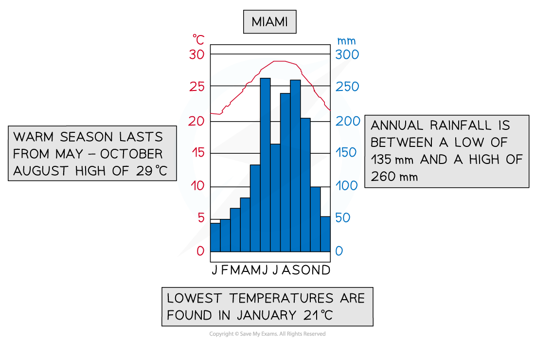
Climate graphs
A climate graph shows mean monthly temperatures and precipitation rates over 30 years
They can be local, national, or global
Precipitation is always shown as a bar graph and temperature as a line graph
Describe the overall shape of the graph:
Is the temperature line steep or gentle?
Are there changes throughout the year?
Always mention the months but do not give a month-by-month account
Look for extremes:
Note anomalies - something that isn't following a trend
Summer has the hottest months and winter the coolest (Spring and Autumn are not usually discussed)
Note the highest and lowest temperature and rainfall plus the month in which they occur
Remember to quote units, e.g. Celsius or millimetres
Identify the seasons when most rain or least rain falls:
Equitorial climate regions have no seasons, but refer to seasons in other locations
Remember that the southern hemisphere's seasons are reversed compared to the northern hemisphere
Summer in Australia is Nov - March
Summer in Europe is June - Sept
Work out the temperature range by subtracting the lowest number from the highest
Add the rainfall totals for each month together to work out the total annual rainfall
Divide this by 12 to find the average monthly rainfall
Dispersion graphs
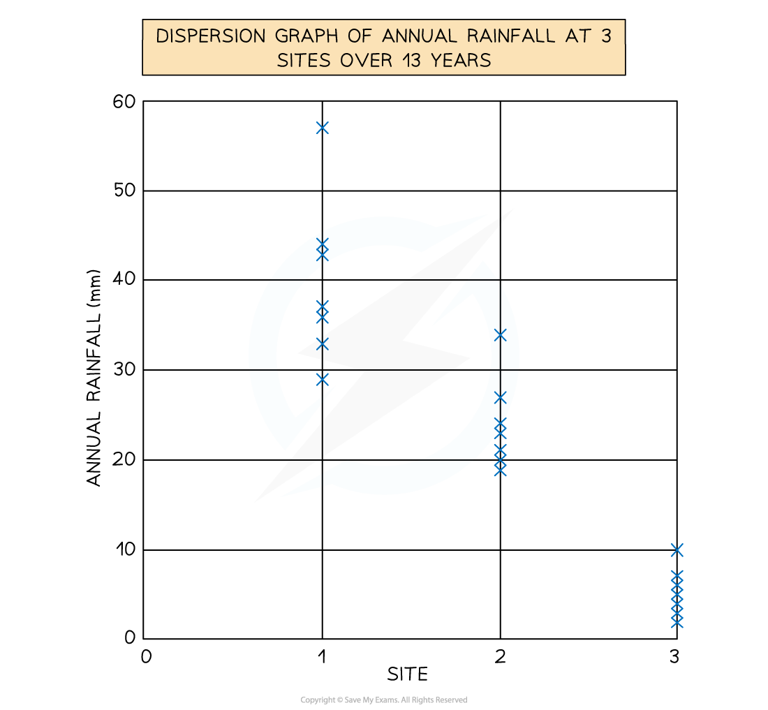
Useful for comparing sets of data
Also illustrates whether the data forms groups or is dispersed (spread)
Values are plotted on the vertical axis
Can also be used to present the upper and lower values along with the mean, median, mode and extreme values
Reading a dispersion graph:
Read the title to see what the graph is showing
Read and understand what each axis represents
Describe the overall pattern of the graph
Identify anomalies in the data
Complete any statistical analysis such as the mean, median and range
Wind rose
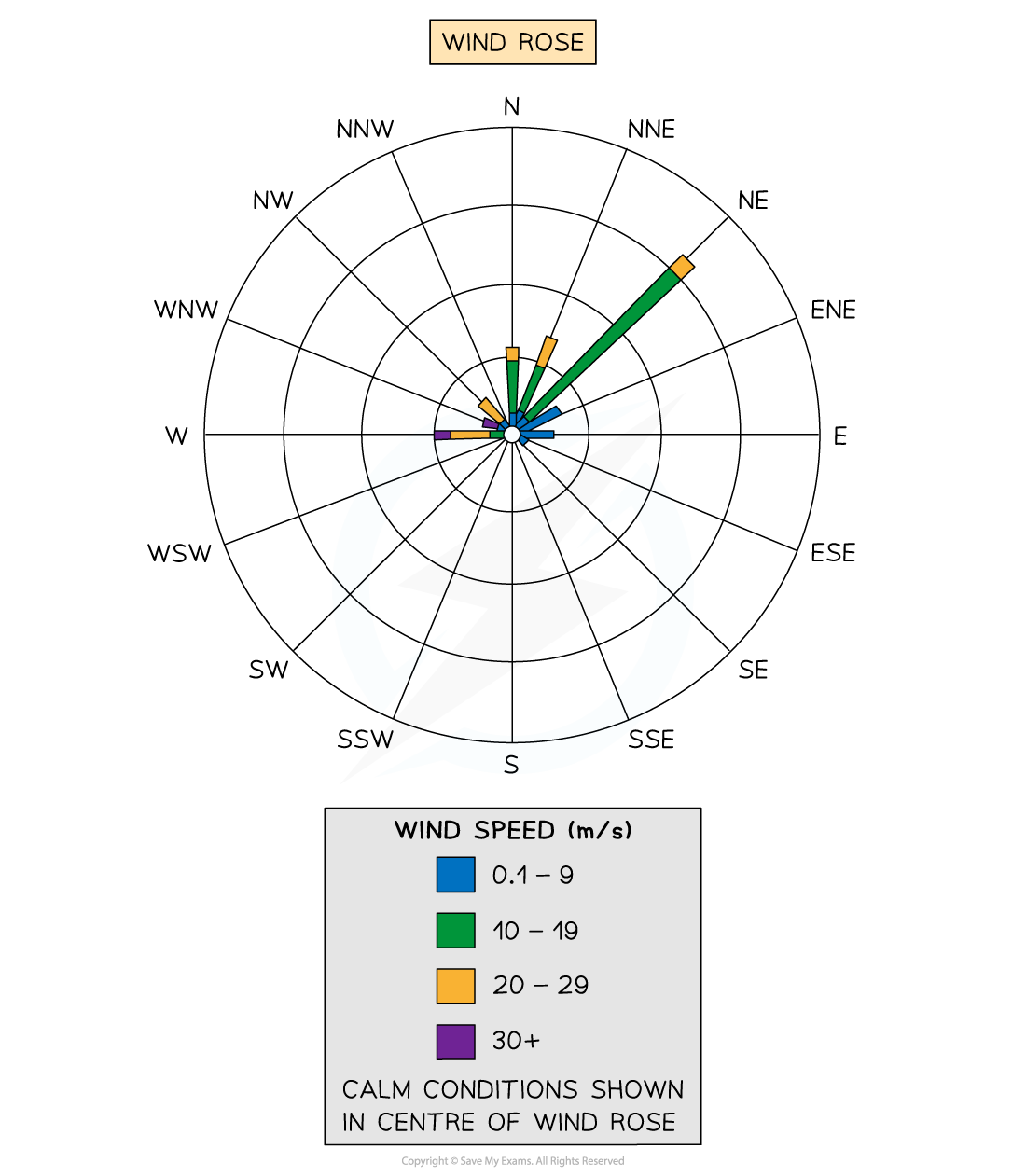
The direction of wind for a specific place is shown on a wind rose
Made of circles that radiate rectangles representing points of a compass
Lengths of the rectangles show number of days or time that the wind blew from that direction
The number of days or hours when there is zero wind is shown in the centre of the rose
Wind barbs
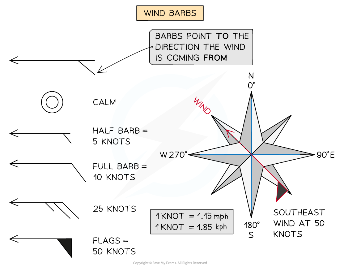
When looking at a weather map, wind direction and strength are shown using wind barbs
Barbs point to the direction the wind is travelling from
The arrow tip points to the direction of the wind
Half barbs represent 5 knots, full barbs = 10 knots and flags = 50 knots
A combination of these symbols shows overall speed of the wind and from where it originates from
A double flag = 100 knots
A double flag and 3 full barbs with a half barb = 135 knots
Isoline and choropleth maps
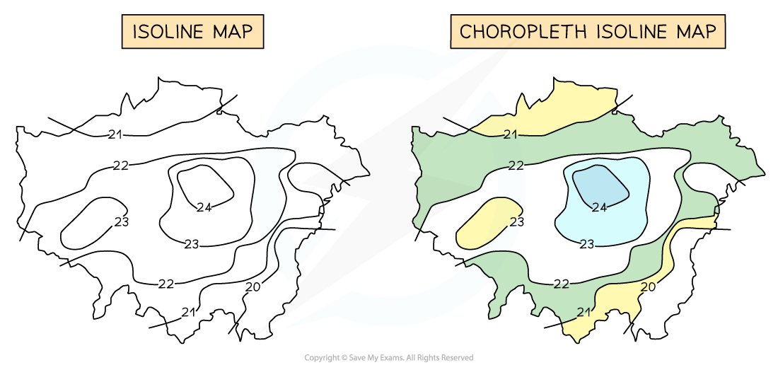
Isohyets are lines joining places with the same amount of rainfall
Isotherms join places with the same temperature
Isobars join places with the same pressure
Isoline maps become choropleth isoline maps when shaded between the isolines
Shading is progressive from light to dark
The heaviest (darkest) shading is for the largest value
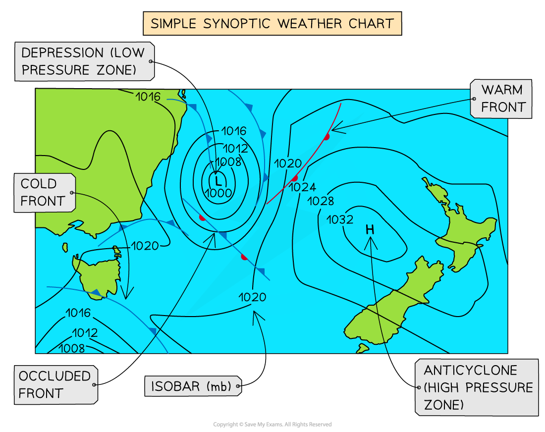
Synoptic charts
Meteorological station readings are plotted on synoptic charts
They can show some or all of the following:
Wind speed
Wind direction
Pressure patterns
Weather fronts
Cloud cover
Temperatures