Supply, Price & Quantity
Introduction to Supply
Introduction to Supply
Supply is the amount of a good/service that a producer is willing and able to supply at a given price in a given time period
A supply curve is a graphical representation of the price and quantity supplied by producers
If data were plotted, it would be an actual curve. Economists, however, use straight lines so as to make analysis easier
The supply curve is sloping upward as there is a positive relationship between the price and quantity supplied
Rational profit maximising producers would want to supply more as prices increase in order to maximise their profits
Individual and market supply
Market supply is the combination of all the individual supply for a good/service
It is calculated by adding up the individual supply at each price level
The Monthly Market Supply of Bread From 4 Bakeries in a Small Town
Bakery 1 | Bakery 2 | Bakery 3 | Bakery 4 | Market Supply |
|---|---|---|---|---|
300 | 600 | 180 | 320 | 1400 loaves |
Individual and market supply can also be represented graphically

Market supply for smart phones in December is predominantly the combination of iPhone and Samsung supply
Diagram analysis
In New York City, the market supply for smart phones in December is predominantly the combination of iPhone and Samsung supply
At a price of $1000, the supply of iPhones is 300 units and the supply of Samsung phones is 320 units
At a price of $1,000, the market supply of smart phones in New York City during December is 620 units
Movements Along a Supply Curve
Movements Along a Supply Curve
If price is the only factor that changes (ceteris paribus), there will be a change in the quantity supplied (QS)
This change is shown by a movement along the supply curve
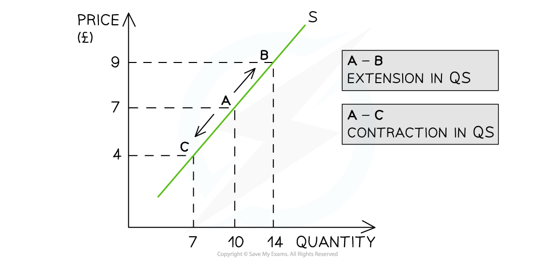
Diagram analysis
An increase in price from £7 to £9 leads to a movement up the supply curve from point A to B
Due to the increase in price, the quantity supplied has increased from 10 to 14 units
This movement is called an extension in QS
A decrease in price from £7 to £4 leads to a movement down the supply curve from point A to C
Due to the decrease in price, the quantity supplied has decreased from 10 to 7 units
This movement is called a contraction in QS