Labour Market Diagrams
Drawing and interpreting labour market diagrams
Drawing and interpreting labour market diagrams
The labour market is a type of factor market
Factor markets follow exactly the same rules as product markets
They are affected by changes to price, demand and supply
They are affected by the price elasticity of demand and supply
Labour market equilibrium occurs where the demand for labour (DL) is equal to the supply of labour (SL)
The DL is the demand by firms for workers
Firms demand more labour as the wage rate decreases, which results in a downward-sloping demand curve
The SL is the supply of labour by workers
Workers supply more labour as the wage rate increases, which results in an upward-sloping supply curve
Individual firms are price takers in the labour market, as they have to accept the wage rate that workers are being paid in the industry
If they offer a lower wage, they will likely struggle to recruit workers
If they offer a higher wage, there will be a large number of workers applying to work there

Diagram analysis
The market for graphic designers is in equilibrium where DL = SL
The equilibrium wage is W and the quantity of labour is Q
There is no excess supply of labour
There is no excess demand for labour
Changes in demand and supply in the labour market
Changes in demand and supply in the labour market
1. Increase in demand for labour
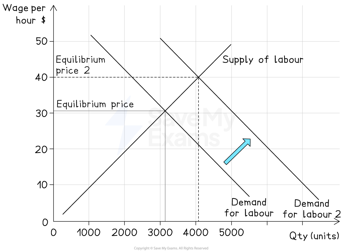
Cause
Economic growth, increased demand for goods and services, higher labour productivity
Effect on diagram
Labour demand curve shifts right (D1 → D2)
Result
Higher equilibrium wage rate (W1 → W2) and more labour employed (Q1 → Q2)
2. Increase in supply of labour
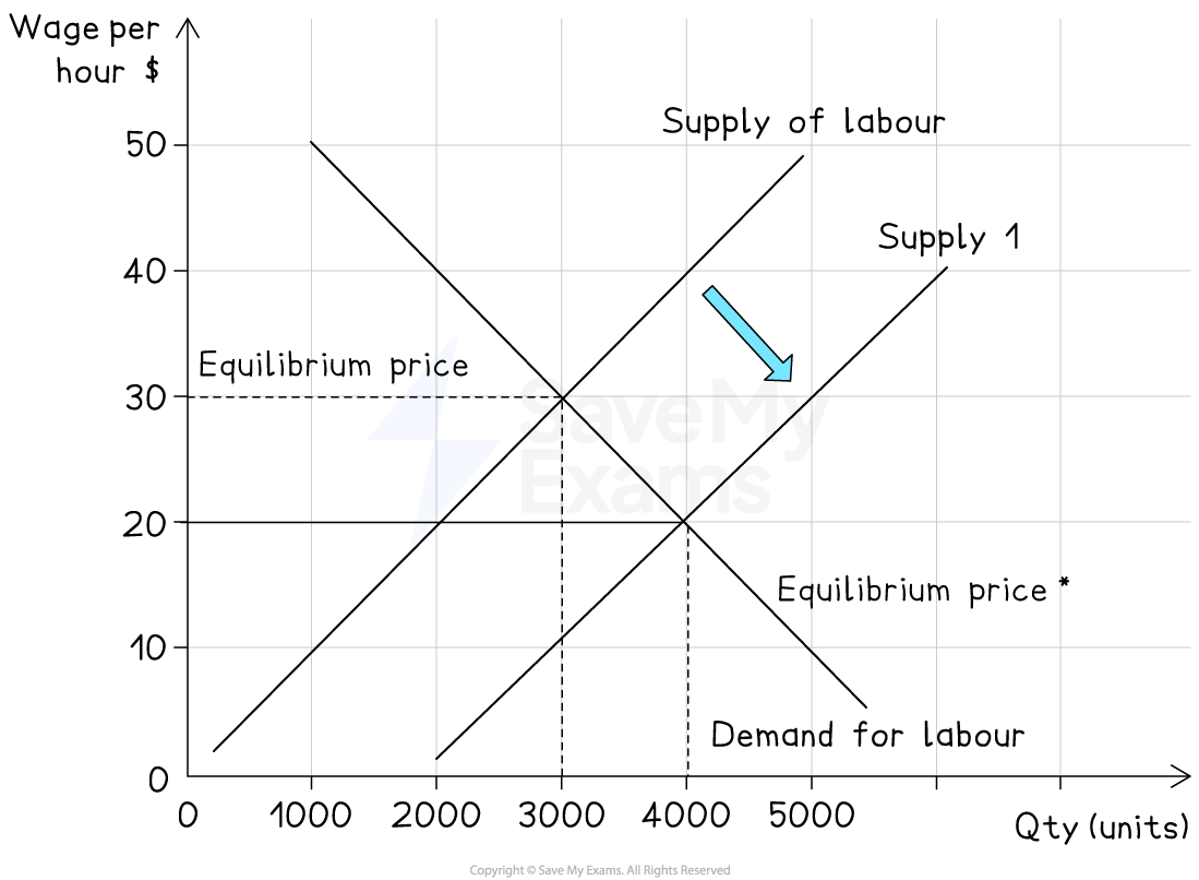
Cause
Immigration, higher working‑age population, more flexible working patterns
Effect on diagram
Labour supply curve shifts right (S1 → S2)
Result
Lower equilibrium wage rate (W1 → W2) and more labour employed (Q1 → Q2)
3. Decrease in demand for labour
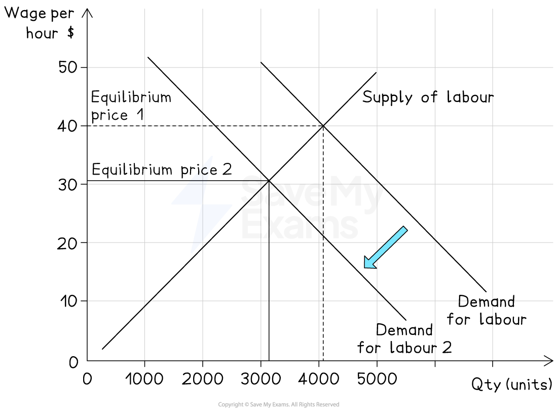
Cause
Recession, automation replacing workers, falling demand for goods
Effect on diagram
Labour demand curve shifts left (D1 → D2)
Result
Lower equilibrium wage rate (W1 → W2) and less labour employed (Q1 → Q2)
4. Decrease in supply of labour
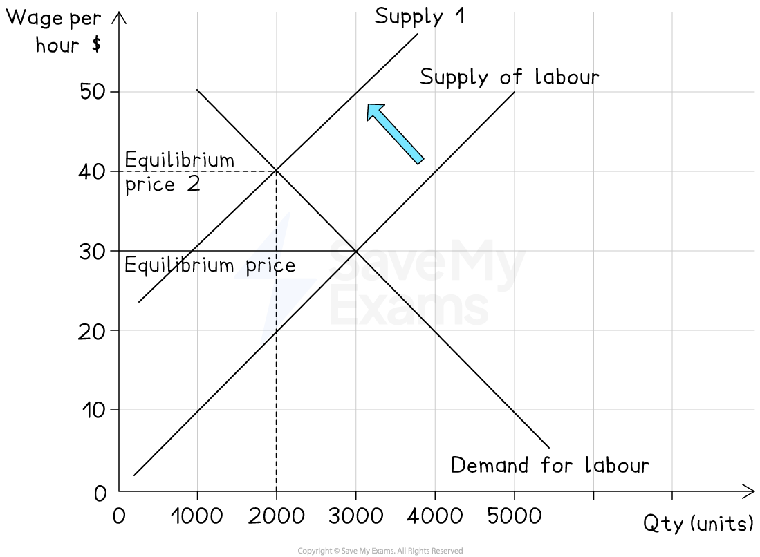
Cause
Ageing population, emigration, higher welfare benefits reducing incentives to work
Effect on diagram
Labour supply curve shifts left (S1 → S2)
Result
Higher equilibrium wage rate (W1 → W2) and less labour employed (Q1 → Q2)
Analysing the PED and PES of labour
Analysing the PED and PES of labour
Price inelastic demand and supply
Consider the labour market for NBA basketball players
In 2022, LeBron James received a salary of $45m

Diagram analysis
DL is the demand for labour from the basketball clubs
SL is the supply of labour by the basketball players
The demand for highly skilled players is very price inelastic
Clubs want the very best players, almost irrespective of what they cost
The supply of highly skilled players is also very price inelastic
A significant increase in price will have little impact on the quantity of labour supplied in the market, as it takes years to develop LeBron James-type skills
The market equilibrium is found at W1Q1 - a high price and relatively low quantity
Price elastic demand and supply
Consider the labour market for labourers on a building site

Diagram analysis
DL is the demand for labour from the building company for labourers
SL is the supply of labour by people willing to work on a building site
The demand for workers is very price elastic
If wages dropped a little, then firms would respond quickly by employing more workers
The supply of workers is also very price elastic
Due to it being an unskilled job, there would quickly be an increase in the supply of labour if wages were to increase
The market equilibrium is found at W1Q1 - a low price and relatively high quantity