Analysis of Market Research Data
Quantitative and qualitative data
Quantitative and qualitative data
Once market research data has been gathered, it need to be converted into a form which is easy to understand and capable of being used to support business decision-making
Quantitative data is statistical numeric data that can be used to support decision making
Quantitative data needs to be accurate and interpreted correctly if it is to be useful
It may be collected from primary or secondary sources
Sources of quantitative data include
Financial reports
Survey findings
Marketing or sales data
Statistical research from the government or research organisations
Qualitative research data often requires considerable skill and insight to be interpreted appropriately
It involves comparing and drawing conclusions from opinions, insights, feelings and preferences
It is mainly collected from primary sources such as focus groups, detailed surveys/interviews and test marketing
Both forms of data can help business managers forecast sales, identify trends and make decisions about product development, promotional planning, pricing tactics and other important marketing mix elements
Analysis of graphs and charts
Analysis of graphs and charts
Information presented in graphs and charts is often easy to understand because it is presented visually
Common methods of presenting data include:
Tally charts
Bar charts
Pie graphs
Scatter graphs
Tally charts
A table or tally chart, is a simple method used to record data in its original form
It is particularly useful for recording frequency of an event as it is happening
E.g., It may be used to record the number of customers entering a retail store
Each time a particular event happens, a small vertical line is drawn
Groups of five occurrences are recorded with a diagonal line through four vertical lines
These groups of five can be easily totalled to identify frequency
In many cases, tally chart data is converted into a chart or graph to make it more visually appealing
Bar charts
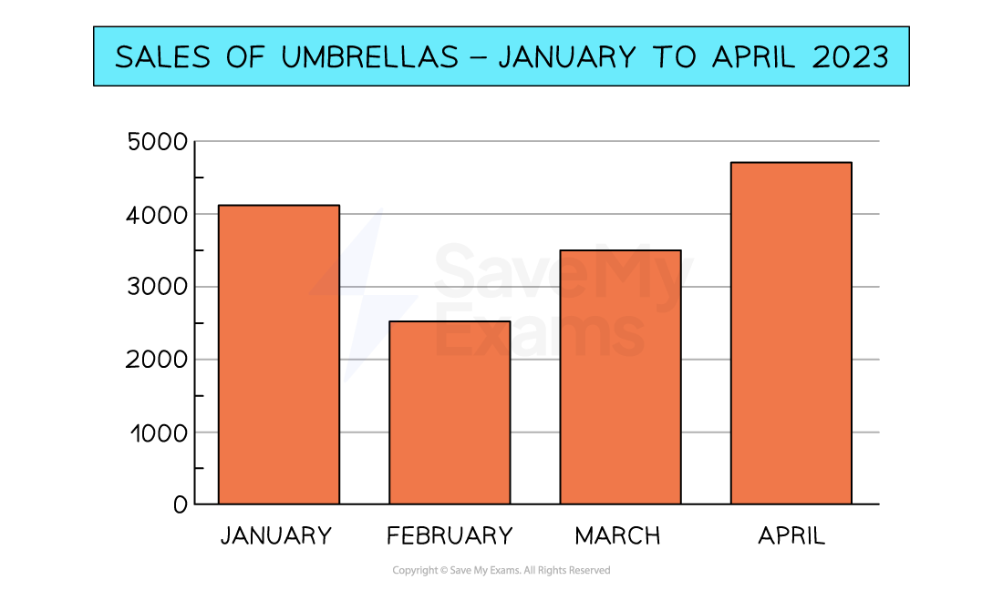
This bar graph provides a clear picture of umbrella sales between January and April and allows a manager to compare sales month by month
Pie charts
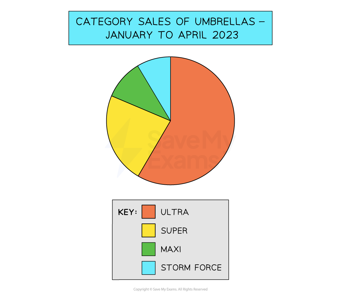
This pie chart breaks down all umbrella sales into those achieved by different models
It shows that more than half of sales were 'Ultra' umbrellas
Scatter graphs
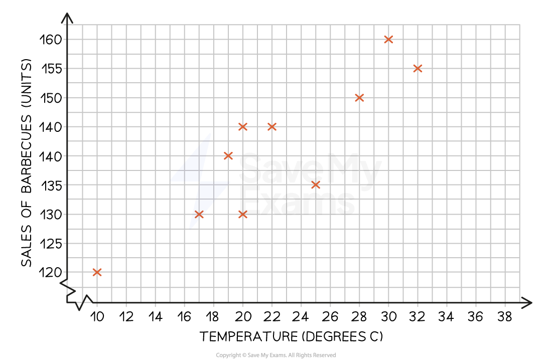
Scatter graphs allow relationships between two variables to be identified
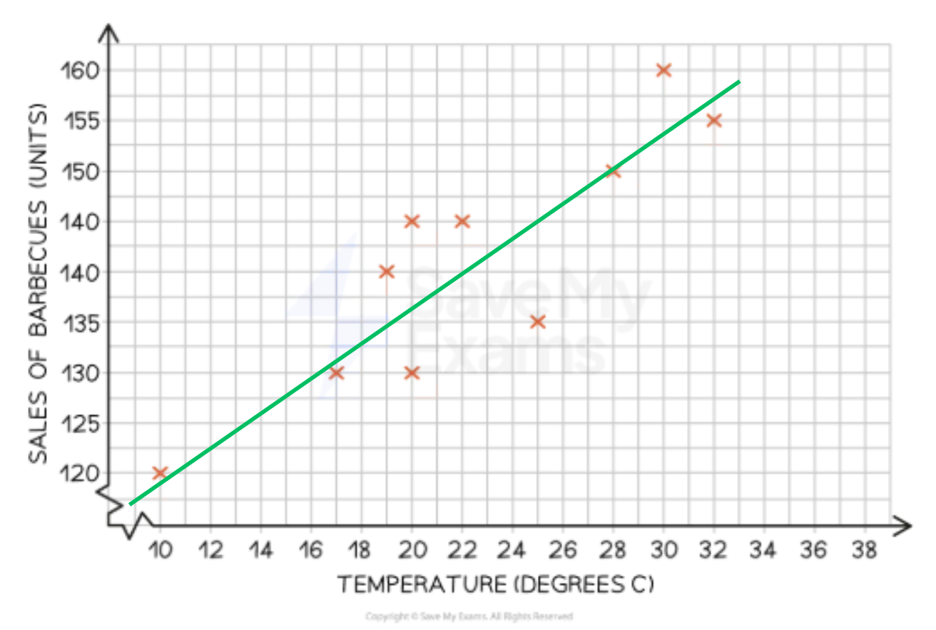
The scatter graph below shows that there is a positive correlation between temperature and sales of barbecues
As the temperature increases, sales of barbecues increase
A line of best fit allows known data to be extrapolated to identify likely sales of barbecues at other temperatures